
Impact of Recent Google Mobile-Friendly Algorithm on Non-Friendlier Websites
It was a few months back when everybody was listening about Google’s new mobile friendly update and now its algorithm has actually been made live on Google search results. The algorithm works to bring the mobile friendly website higher in ranking in comparison to non-friendly websites.
This means that if you have a mobile friendly website, then the algorithm would boost the ranking up. One other update Google has given is that the non-friendly websites need not worry about ranking and competition with the mobile-friendly websites as long as there are no other SEO associated issues. The algorithm would not work on non-friendly websites but if the content is great and totally search result oriented and relevant, then the preference would be given to even the non-friendly websites.
As this algorithm works for mobile-friendly sites, it will function best on mobile phones. The trends Analyst of Google, John Mueller announced that this algorithm is now fully rolled and is functioning fine. He tweeted, “FYI The mobile changes mentioned here are now fully rolled out.”
This tool is made to track mobile devices and not the desktop whereas there are desktop supporting tools for tracking the desktop friendly websites. This is the first algorithm that has been launched for the first time by Google on April 21st last year. The algorithm was being made functional on the website and it was in continuation for a few days.
One other feature is that this algorithm is page-by-page signal so Google might take time to assess every single page and maybe this is the only reason that it took time to get fully functional. So that depends on the crawling and indexing speed of Google for processing each page of the website, the results could be displayed with a few seconds delay.
Some of the users whose website is mobile friendly, might have already seen the ranking going higher and thanks to Google algorithm update. For users who are not aware whether they are using the mobile-friendly platform or not, they may click on Google Mobile friendly tool and click on mobile guidelines of Google.

With this updates there are thousands of website owners who are really happy as they have now gained the path to have boosted ranking and there would be millions that are trying to make their website mobile-friendly.
This happened because of the growing number of mobile users, employing laptops or desktops “on-the-go” for buying a product has significantly reduced. And when your website doesn’t even show up to the required ranking, it would not be able to invite expected traffic which results in the reduced sales.
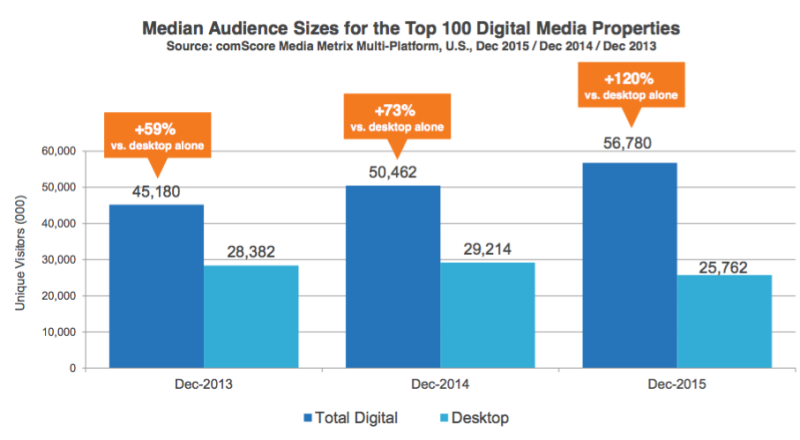
As from the graph below, it is quite evident the rate at which the mobile users are increasing. So we can expect the mobile users to increase and the figure would definitely outnumber the desktop users.
With increasing strictness in Google’s algorithm, somehow it becomes essential to increase the brand exposure even on mobiles. And that is possible when you have implemented the mobile-friendly feature. What are the features that are categorized under mobile friendly platform?
- Enable touch for easy navigation
- Simplified texts and layouts for a satisfied and enjoyable mobile experience.
- Increased compatibility of all the web browsers in mobiles such as Windows, iPhone, Android and even the iPad.
- Quick loading for no interruptions and seamless functionality on phones.
- Automatic adjustments of screen resolutions.
- Enable maps
- Large buttons for easy and fast clicking
- Adding responsive images
- Integration with social media
- Format supported for multiple languages
- Able to locate
- Minimal scrolling
 Does schema.org Markup Really Improve Google Search Ranking Position?
 Learn the Top 5 Local SEO Trends That Can Boost Your Website in 2016
 Schema WordPress Plugin for JSON-LD Structured Data
 Add Structured Data Markup for Articles to your WordPress Blog
{ 7 Responses }