Know How to Establish a Solid FAQ to Reduce Customer Support Tickets
FAQs are very important for all types of serious businesses, not to mention that they are very efficient, as the whole business continues to grow. Once the company blooms and the amount of customers start skyrocketing, the cost of support calls for your customers continues to grow.
These are the times when FAQ pages are essential for your business, as they save a lot of money, while keeping your customers and future customers satisfied.
Besides the fact that FAQs save money, it also serves well in lowering the user’s queue while they are waiting in line to contact your support department.
But, like with many things in life, especially in the business world, you have to give it your best and stay concise and professional. There are numerous things you have to worry about in order to create a truly helpful FAQ page, but before we get into that, let’s see what is the best way to create a FAQ page like this.

How to create a FAQ page
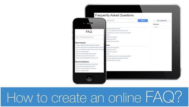
The FAQ page is just another useful and informative page on your website. Your web designer can create an additional FAQ page where all of the common questions will be answered.
However, this complicates things a lot, as you will have additional expenses every time you need a certain change on this page.
On the other hand, relying on knowledge base software is one of the best ways to handle FAQ pages.
There are various options out there, and the majority of them allow you to easily set up and edit pages.
This saves a lot of time, as the interface is pretty easy to understand, making the software very useful and highly user-friendly.
Using FAQ creation software is very easy and everyone around the globe can easily learn to work with it.
A majority of these software solutions are very user friendly, and as soon as you start using one, the next thing you should think about is the actual content of your FAQ page.
What should the FAQ page look like to lower the amount of customer support tickets?

Following this set of rules will make your FAQ page very efficient:
Use the FAQ page only when you have to
Do not just put up answers to any question that comes to mind. Follow analysis and statistics to conclude which questions are actually the most frequent ones.
Then, create specific, yet detailed answers that are going to provide the required information in a concise and easy to understand manner to the consumer.
This is the first way to make your FAQ page well-organized and efficient;
Each set of questions should have a separate category
This kind of organization will make it easier for the customer to find what he or she is looking for.
The longer it takes the user to find the question, the less effective your FAQ is, which means the customer will have to contact your support team.
Pinterest is a perfect example of an FAQ page which contains several categories.
From the moment you are found on their FAQ page, there are several choices at your disposal, which will clearly help you find the answer you were looking for in the first place;
Keep the language simple
OK, you are eloquent and you want to respect a level of professionalism, but in the majority of cases, it is very important to use simple language in order to properly answer a question.
A transparent and clear answer is what the customer wants, so make it easy for him or her to understand the instructions.
There is no need to be informal, but there is no need to use archaic expressions or needlessly complex sentences when answering a frequently asked question.
For example, take a look at these FAQ pages to see what kind of language you should be using;
Consider adding images to your FAQ page
This is one of the best ways of making your FAQ page more valuable. Not only do you provide an easy to understand answer, but you are also literally showing the steps your customer should take to accomplish the desired goal.
Also, in different niches, images are a better choice as they stimulate the user.
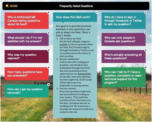
For example, McDonald’s FAQ pages are full of images, which is in this case very important for brand consistency, but also for reminding the user of the great products that this food chain provides.
Once you have created a simple FAQ page that’s easy to skim through, offer some visual aids and gets right to the point without confusing the reader with technical jargon, you’ll need to go over it a couple of more times.
Make sure that you don’t have anything on the page that is not essential and that just clutters everything up.
If you want to have a clearer picture, you can see these awesome examples of high quality FAQ pages.
These are some of the best ways to make your FAQ page flawlessly effective.
Approach the FAQ page with a serious design in mind and start boasting with high user satisfaction.

 Social Media Makes Sales Enablement Easy By Showing How Smart Business Can Be
 3 Ways to Use Pokemon Go to Market Your Business
 What’s Up Bloggers! Roundup #5 with Roxana Nasoi
 9 Pro Tips for a Profound E-Commerce Blog
{ 1 Response }