• Skip to primary navigation
  • Skip to main content
  • Skip to primary sidebar
  • The Famous Blog
    • Blogging
    • Social Media
    • SEO
    • Marketing
    • Design

Famous Bloggers

How To Blog and Start a Business

  • Contribute
    • Submit News
  • Login

Home » The Famous Blog » How Do You Like the New Way to Navigate Google?
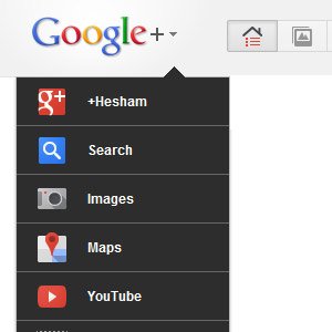
How Do You Like the New Way to Navigate Google?

December 4, 2011 - Last Modified: December 4, 2011 by Hesham Zebida 1,526

New Way to Navigate Google

Google is driving its users crazy, honestly! Tons of updated has been added to the overall site, some of the enhancements are great, some other are not making users happy. Today, I notice a change in my Google account, it’s the new way to navigate Google!

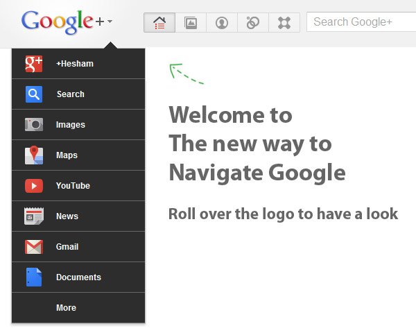
So, welcome to the new way to navigate Google!

The New Way to Navigate Google

The first thing came into my mind when I saw the new drop menu in my Google account is that Google won’t give you a choice to change it as it’s the main menu of the site, this could piss off some people, but well.. I personally like it.
navigate google

I remember one comment I read on my other post about Gmail, the guy asked me in the comment: how much I got paid to love and write a post about Gmail new look!

My answer is I never got paid to write about Google or review their site 🙂

I just love the new look of Gmail, I think the new YouTube look is not bad, but I love the new way to navigate Google! I think removing the old top navigation bar cleared the page, and it actually look better, at least for me, I love drop down menus because they save space on page.

Now, it’s your turn…

I know that it’s nearly impossible to make every one, so Google won’t be able to make all its users happy with the changes they make to their site.

So, honestly, what you think of the new Google drop down menu?

ShareTweet

Filed Under: Google

About Hesham Zebida

Follow @hishaman

I create websites with WordPress, and I develop Schema Plugins to help SEOs. I am a social network lover. I am also the night creature who works hard to keep this project up. Owner and founder of the Famous Blog.

Reader Interactions

Related Posts

  • Schema.org & Google Search Ranking PositionDoes schema.org Markup Really Improve Google Search Ranking Position?
  • Learn the Top 5 Local SEO Trends That Can Boost Your Website in 2016
  • Google Mobile SearchImpact of Recent Google Mobile-Friendly Algorithm on Non-Friendlier Websites
  • Schema JSON-LD WordPress PluginSchema WordPress Plugin for JSON-LD Structured Data

{ 41 Responses }

  1. Christa Joe says:
    New notification in Google looks great. Even more useful in a user's perspective, sliding navigation, easy to use.
  2. Raheel says:
    This is cool but i like the new layout of Google Plus much better then the last one
  3. Mohsin Ali says:
    Sorry to say but i don\'t like this new style from Google. Over the years we use to the old design and suddenly this new design is not going to help specially for me.
  4. Asaf D says:
    this is really annoying. all i really need is to use google calender. now instead of 1 click, i need to search for it and use at least 3 clicks if not 4, and to try and understand where it is... at the eand of which, I don't even remember why i wanted to access the calender in the first place!!!! this change sucks big time!!!!!!!! i hate it really bad. really, someone ought to get fired over thinking this would be a good idea.
  5. Raw says:
    Google's new navigation really pisses me off. How about they give more instead of taking away. They have inconvenienced many of their own users. Listen Google, you should have let us drag our own icons and let us placed them where we wanted in the old school navigation menu. If you dont get your shit together i am going to make my own site.
  6. rhonda says:
    Also don't like the new way to navigate - takes too long and when using my netbook I have to scroll just to get to the GMail icon to click on it. When it was horizontally listed across the top, it was a simple at-a-glance click and I got to my gmail. Not so happy that I have no choice on how to navigate or that I cannot move the scroll down icons around so that my gmail and other more used applications are at the top of the menu drop down bar.
  7. Greg says:
    People seriously need to chill out! Google (and Facebook, etc) are works in progress; they're growing organisms that will never be static and "finished"!
  8. Ian says:
    Slows me down waiting for the popup, otherwise it's just another unnecessary key stroke. Give me the choice please.
  9. Caz says:
    overall don't like it a bit, too slow to get where I want to go, too many submenus.
  10. JimF says:
    IT SUCKS! Longer to get where I'm going, I don't care that what it looks like, it slows me down!
  11. Svetli says:
    I don't like it. It simply takes longer to navigate than it has ever taken before.
  12. WebCharge says:
    it now takes more time to get into gmail, before it was simply at the top and you just pressed on it, now you have to go to the thing, and go down and look for gmail etc.
  13. Matt says:
    I do like the dropdown menu, but I don't like the black colour - to me it doesn't match the overall theme..
  14. name says:
    Move -> Click of the old bar was superior to Move -> Hover -> Move -> Click of the new bar. Google has given up on streamlined operation in favor of flashy menus. Fail.
  15. Ammar Ali says:
    I like this new Google Style. Very Nice !
  16. christajoe says:
    Google's new drop down menu instead of black navigation bar is so good. Now you can click on drop down list and go to that page directly instead of navigating other Google services.
  17. Matt says:
    Some of the changes I like, some I don't. This new change may have potential, as it opens up usable screen space (assuming Google removes the "Welcome to the new way to navigate..." bar & doesn't just replace it with extra white space). The drop-down list, however, has been implemented VERY poorly. The list across the top has always been poorly implemented (e.g., not including Google Reader a default option, not letting users choose which sites to see in the default list). Now the list is even less functional. Google Calendar is not on the default list. What idiot decided that I should have to go through 2 drop-down lists just to get to the most used button? & there's no reason to have a Search button in that list. It's pointless. Placing links to Youtube & News are merely ploys to get more people to use their other websites. That would be perfectly fine, but not at the expense of functionality. As others above me have stated, people migrated to Gmail because it was so much better than other email clients. The difference is not so obvious anymore, & Google keeps pushing the envelope in the face of mass customer complaints.
  18. PrIyAnGsHu says:
    Yeah , I really like this new navigation bar of Google search . This enhances our ability to search for proper content !
  19. Madhav Tripathi says:
    I have not tested this navigation bar yet, it looks interesting. However the new looks of Gmail and Google search , YouTube are fine.
  20. Sandeep says:
    I like it: clean and simple interfaces (as opposed to the increased clutter of many other sites). I just wish the drop-down list was customizable: there are so many Google products, that it's more than likely that users will have different preferences.
  21. c says:
    When the new format of MS word was introduced no one I spoke to liked the concept, as a basic user, I would encourage people to refrain from judgement until the the new search has been in for some time, this will allow people to get use to it and only then be able to make an informed judgement?
  22. Vadim says:
    I don't like it for the following reason. Google Scholar is not in the drop menue, not even under "More", and I use it a lot for my work. Now to search Google Scholar I have to go to the Google Scholar page and submit my query there. It's very inefficient. I'm sure that many researchers and university students will agree with me.
  23. Justin Germino says:
    Drats, I don't have the new Google+ look yet, everything same for me. I do see the new YouTube layout though.
  24. Kimberly Gauthier says:
    I love all of the changes except one and I have a feeling I can change that if I change my colors. When I'm in my email, the scroll bar disappears and I have to hover just right to get it back. It's frustrating when I'm rushing. Everytime I see this, I remind myself to try another theme, but never do. So as soon as I finish typing THIS, I'm trying another theme.
  25. keith says:
    Too many things change, whether it be google or facebook. There must be some algorithm out there that they receive a zillion more visits when they change the interface because, it doesn't matter if you like it or not, they will change it in 3 months.
  26. keith says:
    For me, I just get sick of all the changes, things are working well, you know how to navigate quickly and easily then BAM! They change. Facebook does this all the time too, I find it frustrating because even if the ease of use is improved, you know they will just change it again.
  27. Tushar says:
    i always like changes and Google have brought lots of them in last few weeks. Some are good but the one on Gmail is not that attractive. But laurels for Google team, atleast they are trying something new
  28. julie says:
    great blog...... personally i really like the clean and simple design thatt Google has now done. youtube has done a great job too!
  29. Alex says:
    Hello Hesham, Google wants to keep a clean interface but also wants to keep in front of facebook with their google+ (although they weren't in front to begin with). My account hasn't been updated either, but I can already see a motif that google also used with their new youtube interface. I think they want to make some trademark designs (just like a bmw grill)
  30. johnpj says:
    easy to look and clean
  31. Cindy says:
    first i recognized the change on my youtube account and than on my google account... I think it is pretty much better than the older one; it is easier to use, faster to navigate, and I also like the design of it. It would be so nice if all the changes were positive like this.
  32. DiTesco says:
    Man, I have to move to the US so I can see all this changes without having to wait, lol. Anyway, while I am waiting for that feature to be available on my account, I will take your word for it that it is cool :) haha... Seriously, just by looking it does seem that the interface is cleaner and that in itself is a good thing, for me at least..
  33. libertyaz says:
    How Do You Like the New Way to Navigate Google? Hello, webmasters, This is best way to navigate google very easily.....
  34. Mech says:
    Your blog is very informative. Thanks for sharing information. I like simple design such type of Google.com.
  35. Dave Lucas says:
    Hesham - Google likes to push the envelope. This is just a small preview of what will befall those who embrace "cloud technology" - everything you love can be changed with no input from you - and unlike your personal PC or laptop, you have no control over what version or what particular "skin" of a program you are using. Mark my words: if Google pushes people too hard, the smart tech-savvy ones will find alternatives. Blog ON!
  36. Nasif says:
    I am not seeing any changes. I think my account has been updated yet.
    • Nasif says:
      *has not been
  37. Helmi says:
    I love the clean and simple design concept that Google now adopt. But for the youtube redesign, I find it to be pretty confusing. I feel that the navigation is better with the old design.
  38. Shiva says:
    I must be missing something because Google.com looks exactly the same to me. But then again Utube looks the same too
    • Hesham Zebida says:
      Give it some time, maybe not all accounts are updated yet!
      • Shiva says:
        Yes you are right, my youtube was different this morning. Looks nice

Primary Sidebar

Our Newsletter

Our Newsletter

Join our mailing list to receive the latest news and updates from our blog.

You have Successfully Subscribed!

Popular Articles

  1. How to Set Half Rating Scale 1-5 (Poor to Excellent) by Words 116,076 views
  2. Top 10 Sites Where You Can Get Paid to Write 115,888 views
  3. How to Get Targeted Twitter Followers Fast 92,104 views
  4. 66 Awesome Social Media Quotes 78,422 views
  5. 50 Traffic Sources You Should Milk Like Crazy 75,143 views
Schema Structured Data for wordPress
  • Blog
  • Contribute
  • About Us
  • Contact Us
  • Disclosure Policy

Copyright ©2020 · FamousBloggers - All Rights Are Reserved · Powered by Genesis Framework

  • Login
Forgot Password?
Lost your password? Please enter your username or email address. You will receive a link to create a new password via email.
Go to mobile version