How to Increase Your Sales with Interesting Web Design

Many people overlook web design when it comes to making a sale, when it is a well-known fact that web design alone can account for 99% of a buying decision. You would not overlook the layout of your store if you set one up on the high street, so why would you overlook your online storefront? Do not forget that the process works the other way too, which means that your web design has the potential to scare away customers.
Use your web design to funnel your web traffic
Funneling is a tried and tested method that is still used today to great effect on the Internet. Funneling got its name because the process is similar to catching rainwater in a funnel.
Firstly you grab as much traffic is possible from a broad and diverse mix, and then you move them all in the same direction until they all arrive at the same place, which is where you make your sale.
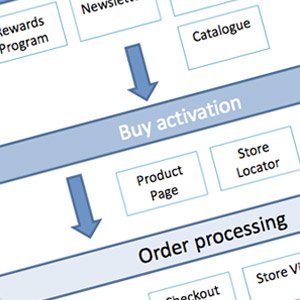
The way a website is structured allows people and web developers set up a funneling system using their web design. Each page and each link leads a person on to the next stage of the selling process. As the user moves further and further along the webpage process, they are brought closer and closer to closing the sale.

Source ProBlogger.net: Understanding your conversion funnel
How you set up your funnel is up to you, but it is suggested that every time you move the user onwards you ask them a question. The answer you are looking for is “yes” and they indicate “yes” by clicking the link that moves them on to the next stage of the process. Obviously, you need to do this with a certain degree of subtlety.
For example, you could have a link that says, “Do you want to know more?” This is obviously a fairly crude example, so you need to find ways of getting your multiple “yes’s” so that’s when the final call to purchase comes, the user will automatically click the link and purchase.
Use website design to make one product appear superior
If you are designing your product pages, you would be a fool to go for a catalogue design. It works well and it is going to get the point across but it is not going to make you any further sales. You can use your web design to make one product appears superior to the others. There are a number of ways to do this, and to be honest you’re only limited by your own imagination. Nevertheless, here are two examples of how you can make one product appear superior to the others without making it overly obvious that you are trying to promote one item over another.
Set up your catalogue pages so that you have five products per line. On each line, you have five images, and five different products, along with a brief overview of their details underneath each picture. Assuming that all the products are of similar things, for example pendants, then you should make the second one from the top left a little brighter than all the others. Many people will do this by increasing the color of the background, but you should not do this.
You should keep the background color and shading the same as all the other images, but you should make the pendant itself (as per this example) brighter so that it stands out more compared to all the others. In laymen speak, if you were to edit the photograph yourself, you would be increasing the color of the highlights and not the shadows (But this assumes that the image was taken with a flash bulb).
Another example of a where you can use web design to increase your sales comes from using pyramids. Let’s say that you have your products with the images and this short descriptive text underneath. Again let’s say that all the products of a similar ilk.
You can make a pyramid where you have your best product at the very top, which then has two products underneath in a line, and underneath those are three products in a line, etc. You can go the opposite route and have a line of five products on the top, which goes down to four, which goes down to three, to two and then one – with the one at the very bottom having a slightly larger picture and slightly more overly promotional text underneath it.
With the previous example if you really want to hit the nail on the head, you could even have arrows pointing down saying something like, “but it gets even better” or “if you don’t like that then you will love this“. Using a technique like this may be needed because sometimes the user needs an incentive to make them scroll down. You may not want to risk your users seeing the first five products and then clicking back before they see your very best product at the very bottom of the pyramid.
Author:
My name is Loretta. I am a web developer at worldsystems
 5 Conversion Rate Optimization Tips All Bloggers Should Know
 How SEO Services Can Help Increase Your Website Traffic
 3 Ways to Use Pokemon Go to Market Your Business
 5 Easy Ways To Impress More Of Your Website Visitors
{ 10 Responses }