• Skip to primary navigation
  • Skip to main content
  • Skip to primary sidebar
  • The Famous Blog
    • Blogging
    • Social Media
    • SEO
    • Marketing
    • Design

Famous Bloggers

How To Blog and Start a Business

  • Contribute
    • Submit News
  • Login

Home » The Famous Blog » Does Your Site Design Turn Off Visitors

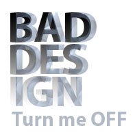
bad design

Does Your Site Design Turn Off Visitors

September 22, 2024 - Last Modified: December 17, 2024 by Kristi Hines 45 Comments

Have you ever searched for something on Google, and clicked on a search result based on the page description because it sounded exactly like what you were looking for? Then, when you arrive on the page, you were almost immediately turned off based on the page design or layout, so much so that you hit the back button to try another result?

This has happened to me many, many times, and I’m sad to say that I may have missed out on great content because of the way the blog or website is designed. Here are some design-based reasons I have left a page that promised relevant information.

Pop-up Adverts

Probably one of the most common reasons I have left a web page before I found the content I was seeking is because of those pop-up advertisements that will not go away. I can forgive the simple small ones that want you to join their mailing list, although I think if you are a first time visitor, you should be given time to find out what the site is about before being asked to receive updates for it.

The unforgivable ads are the ones that do not take into consideration visitors on a lower resolution display. Because of their large size and the fact that the ad is fixed in place, I cannot get to the close button, or worse, there is no close button for a certain length of time unless you do sign-up for the offer.

Almost Endless One Page Sales

Another popular design flaw is the almost never-ending one page sales site. Some of these items I’m sure are great deals, and I know the goal is to give me so much great information that by the time I find the price, I will already be sold. But these sales pages need to consider the fact that not everyone wants to scroll through ten lengthy testimonials, the “wait, act now and you’ll also get” additional offers, videos, and what not.

I think these sites would better served if they just stated what the main benefit of the product is, have one video, one testimonial with a link to others, if people are interested, a list of additional items with a short summary and link for additional details, then the price. Because I have left many of these sales pages simply because if the page is that long, the deal is probably not that great. Since these blogger templates are so popular, if I don’t know a little about the product before I hit the page, I leave almost automatically when I see that it is that kind of page.

One sales page I like in particular is the one for the 31 Days to Build a Better Blog. While it is a long page, it isn’t endless, and it gets to the main point – product price and purchase button – early on and often throughout the page, as opposed to having to scroll down to sometimes the bottom or close to the bottom and then searching for what you really want to know. It’s also not just the one page sales ad – it is built into the blog, so you can see that there is a lot more to offer than just that product.

AdSense Blog Themes

You know them. The blog themes that are designed specifically for AdSense. I have nothing against AdSense, because I do use it myself. But I think that you can have a well designed theme and just include the AdSense. Also, there is nothing worse than having to wade through the ads to find the real content. If I can’t spot a navigation system and the first post on the blog because of all of the ads, I typically move on.

Really Old or Standard Templates / Themes

Typical information seekers on the Internet are looking for the most current, relevant content. It is hard to believe on the first impression of a site using a web layout that looks over five years old that it is going to have up to date information. So if you are using a really old theme, or one of the generic ones supplied by your blogging platform, it might be time to update it to something newer.

If you are on WordPress, look up the latest themes by searching Google for WordPress themes and then narrowing your search results to articles that have been written this month. If you are on Blogger / Blogspot, go beyond the basic ones offered through their system and try sites like Blogger Templates. Even blogging sites like Tumblr have more themes than just the standard ones available through their main site.

More Design Faux Pas

When you are perusing content on the web, what design and layout elements deter you from actually getting to, or even caring about the content?
ShareTweet

Filed Under: Design, Talk

About Kristi Hines

Follow @thekristihines

Kristi Hines is a freelance writer, ghostwriter, and copywriter who develops blog content, ebooks, emails, lead magnets, and website copy for marketing agencies, B2B, and SaaS.

Reader Interactions

Related Posts

  • Is a Custom Design Essential to Your Blog’s Success?
  • Should a new blogger get a custom design for his blog?
  • Design Landing PagesHow to Not Design Beautiful Ineffective Landing Pages
  • OptimizePress Wordpress ThemeOptimizePress WordPress Theme for Amazing Landing Page Conversion

{ 45 Responses }

  1. Andreas Pazer says:
    Web design is by and far one of the most important if not the most important aspect of any website. The look and nature of a website can break or make the website. If a website is poorly designed or is hard to navigate, then chances are that your website will fail to produce the results that you desire. In fact, a poorly designed website can turn-off visitors and cause them to never browse or return to your website again.
    Reply
  2. Usman says:
    In my humble opinion, loading a site with ads is not a problem. You only have to make sure that the users gets to see and concentrate on one item at a time. There should be no distractions which may spoil user experience.
    Reply
  3. Bryan Sinclair says:
    Certain design works for certain blog. I mean that event the best design may not work for a certain website or blog. As long as the volume of traffic is high, the design doesn't matter.
    Reply
  4. Dave Lucas says:
    Hi Kristi! A few weeks ago, I ALMOST succumbed and assigned a new template to my blog. I'm glad I didn't, because, unlike so many other blogs, my blog has a particular look and feel: a "trademark" if you will. In answer to your very first paragraph, YES and NO! A ladyblogger friend of mine with a PR7 told me the other day "it doesn't matter what your blog looks like. CONTENT is king. She also recommends 1 column and 1 sidebar per blog, unless You have a blog like hers where advertisers are anxious to buy space: she has 1 column and 2 sidebars and not a single ad from any of those widget-based advert services! Her blog, which i'm not going to publicly criticize, is an awful eye-popping mess. Its only redeeming quality is that there are no popup ads! But when her articles push people's buttons, she gets boatloads of hits, comments and trackbacks. There are TOO MANY new blogs that look exactly the same (with a few color variations etc. here and there) and I'm running across new ones that don't "self-adjust" for screen size, meaning I have to "scroll sideways" - now THAT is something that makes me leave a blog immediately! I've also seen it happen where a blogger adopts a new template and in a few weeks, the site hosting the graphics suddenly isn't hosting them anymore because the template designer stopped paying the bill... Another "Design Faux Pas" is oversized fonts. Don't scream at me with big letters that make me feel like I must be in First Grade! I agree with you on the popups, BUT too many bloggers (even some of our very own "Famous Bloggers") are now using popup tricks for subscriptions and other features and that is DOUBLY annoying! We know you want to make a little extra money, but PLEASE knock it off with the popups!
    Reply
  5. James Moralde says:
    It's those sign up forms that cover the whole page and disables the underlying page until you either close it or sign up. And some of them even make the sign up form so big that you have to scroll down to search for the 'close' button. Pop ups, that too. Adsense? Well, readers grow some blindness to it eventually, so it's not an issue.
    Reply
  6. Jean says:
    So far I have no ads cluttering up my food blog. And I am using a basic theme/template that I like very much because I happen to like simple and uncluttered. I've actually had compliments on the look of my blog, so I hope it is not holding me back! Of course, I'm doing another "no-no" -- posting just once a week, on Friday morning. My food is fabulous, but I'm no techie!
    Reply
  7. Udegbunam Chukwudi says:
    The thing with adsense blog themes is that some folks say it generates more adsense clicks as visitors sometimes get frustrated wading through ads and most of them click on ads to get away from the site ;) .-= Udegbunam Chukwudi@Work Online Nigeria´s last blog ..StrictlyOnlineBiz’s Top Blog Posts Of The Week 6 =-.
    Reply
  8. Dennis Edell says:
    I hope you don't mind a link, but I wrote a semi-popular post regarding advertisers and how they feel about design... The comments are now closed since I moved all to the new blog, but it will resurface there eventually also. :) .-= Dennis Edell´s last blog ..The Time Has Come. The Deal Is Done. It’s Time To Move!! =-.
    Reply
    • Hesham says:
      I had to remove the link from your comment, I heard you are moving ;) so no broken links allowed here!
      Reply
      • Dennis Edell says:
        Did you by chance click it first? It's not broken... .-= Dennis Edell´s last blog ..The Time Has Come. The Deal Is Done. It’s Time To Move!! =-.
        Reply
        • Hesham says:
          Of course I check it before removing it, it's not broken now, but it will be when you move ;)
          Reply
          • Dennis Edell says:
            Not with the proper redirects and not for several months at that. ;) .-= Dennis Edell´s last blog ..The Time Has Come. The Deal Is Done. It’s Time To Move!! =-.
            Reply
  9. Keith Bloemendaal says:
    I agree with you Kristi. Especially when bloggers approach you for advice on the new site and it is loaded with ads. Give it a chance to build up some traffic! If you are targeting other bloggers to come to your site ie: you write about blogging, seo, wordpress etc... chances are, the ads will not produce. I believe you need a lot of search traffic for ads to be any benefit, so in the beginning I always say keep them to a minimum. Design is difficult as the beauty lies in the eyes of the beholder, what some think is a great design and layout, other might find terrible. Another place where testing is a must. .-= Keith Bloemendaal´s last blog ..My Blogs Are Like Children =-.
    Reply
  10. Gail says:
    My pet peeves are AdSense ads between the post title and the text, pop-ups, too many AdSense ad blocks and any box that gets in the way of reading. Even if those are effective I wonder how much they reduce how often those sites get reviewed at StumbleUpon, shared anywhere or linked to from blog posts? I very rarely share or link to sites with those issues. .-= Gail @ Dofollow Lists´s last blog ..Twelve Generous FollowFriday Folks =-.
    Reply
  11. Dennis Edell says:
    Scrolling sales pages - these will be around for as long as they continue to work; I hate them also. Adsense - the one that really rubs me the wrong way is place above the content...when I hit a blog through a link and have to scroll, even a little to get to the content i want there to see.....ARRG! Side note: Oh man oh man am I about to start some controversy. I am this close to launching the blog I'm moving too....in the default wordpress theme!! Muahahahaha! If visitors stick around through the first two posts though, they will fully understand why, and hopefully have some fun with it. ;) .-= Dennis Edell´s last blog ..Blog Move Is Imminent ! I’m Looking For Launch Partners… =-.
    Reply
    • Dennis Edell says:
      Oops, how about an edit comments plugin. LOL .-= Dennis Edell´s last blog ..Blog Move Is Imminent ! I’m Looking For Launch Partners… =-.
      Reply
      • Hesham says:
        We are running lots of plugins already, and I don't think I am going to add a plugin to edit comments, I want to remove some plugins from here ;) Never mind about mistakes! be natural!
        Reply
        • Dennis Edell says:
          You asked for it! Muhahahahahaha .-= Dennis Edell´s last blog ..Blog Move Is Imminent ! I’m Looking For Launch Partners… =-.
          Reply
  12. Deepika says:
    Blog theme is very much important and it should attract our visitors. It should not irritate them. Advertisement should not much it should me minimum and we should place ads relative to our blog.
    Reply
  13. Gabriele says:
    What turns me off are blogs or webs which have no contact option. Often, I am approached by webs who want a links exchange via some portal. You look at how they structure their linkspage or directory and wonder where they may stack you away. With no chance to even contact them this is definitely a turn-off. Anyway, as it may be a waste of time seeing such conditions, I delete the request. Otherwise my biggest objection are also sites with pop-ups. Otherwise, I close a web straight away, when I notice a redirection coming up. Also, it helps if a blog has an about me or about us section. In Germany this is called "Impressum" and everybody must have one by law. I agree that the latter is important for companies which may sell something or provide important information. However, that such laws exist may make you think. .-= Gabriele´s last blog ..Jan 7, Spain Puerto de la Cruz North Tenerife with unusual photos =-.
    Reply
  14. Mitch says:
    I hate those popups as well, but something else that's just getting on my nerve are those toolbars for things such as Digg or, well, whatever the others are for, that cut off the reading real estate, if you will. Sometimes I close them, sometimes I just get irritated and go away. .-= Mitch´s last blog ..Leno Vs. O’Brien – I Called This One =-.
    Reply
  15. lawmacs says:
    Blog design is very important to me this is just as important as its content content is king no dougbt about that but a good design is eqaully important .-= lawmacs´s last blog ..5 Link Building Tips =-.
    Reply
    • Kristi Hines says:
      I guess another way to look at it is kings are always dressed well, never sloppy. So if you want your content to be king, you have to dress it appropriately by design. .-= Kristi Hines´s last blog ..Freelance Friday – Social Media for Job Search, Client Rating Scale & More =-.
      Reply
  16. element321 says:
    As a designer, I see a lot blogs that are cluttered up and just full of ads. When I see these I leave those blogs and almost never go back there unless they have something important enough for me to go back to their site. As for site, I currently use a theme, but plan is to stay current with the more popular designs. It took me several weeks to add adsense to my blogs, but finally I found some decent looking ways to add them without hurting the design to much. .-= element321´s last blog ..What is Creative Commons =-.
    Reply
    • Kristi Hines says:
      I think with Adsense, there is a right and wrong way to do it. But it also depends on your goals. If your only goal is to get random one-time visitors to click on your ads, then it doesn't matter what the site looks like. But if you want loyal readers and return traffic, you will want to blend your ads well to make them more visually friendly.
      Reply
  17. Kiesha says:
    You are absolutely right about how the design affects perception. When pictures are aligned properly, or they're different sizes for no reason and text is just wherever - it doesn't matter how innovative your content is, people are going to leave your site. It's sad that visual appeal comes first and foremost, but the reality is that it does. I've found some beautiful sites with lousy content, but because my eyes liked them, I hung around and followed the author. I know, it's not fair... .-= Kiesha @ Highly Favored´s last blog ..Consumptive spending is wasteful spending =-.
    Reply
    • Kristi Hines says:
      I think it is like when you see two people talking... one is professionally dressed, and the other one is looking a little too casual. The professional one will almost always be the one who is taken more seriously than the other.
      Reply
  18. Melvin says:
    Its true. A lot of people are always saying that content is the king and Im just tired of it. Content is the king only if they care to read it. Design and aesthetics are key part of a websites success.. .-= Melvin´s last blog ..Your Guest Post was Rejected, What’s Next? =-.
    Reply
    • Kristi Hines says:
      Site design is really a first impression. Whether people like to admit it or not, most are attracted to the visually appealing, regardless of what lies on the inside in terms of the content.
      Reply
  19. Latief says:
    Agree with you sister ;) may be I can give you one more. Me, link ads, this is very bothering me, very annoying because I search for get more information by reading the content and the ads shown and break my concentration. I know the owner have the right to put anything on their blog. LLike the pop ups, I don't like the link ads. Thanks for sharing.
    Reply
    • Kristi Hines says:
      That is a good point... I think I have grown to expect that text links are going to get me related content on the same site, or a site that is recommended by the blog author. Finding they are ads is sometimes discouraging. .-= Kristi Hines´s last blog ..Freelance Friday – Social Media for Job Search, Client Rating Scale & More =-.
      Reply
  20. Anne says:
    I have found a few popular sites using standard templates and thought, 'why?' But it seems to work for them. What I do hear is many don't respect you [as much] if you are on blogspot.com even if you have your own domain. Excessive pop-ups won't keep me from getting to the information I've come to find, but it will keep me from returning. Long page load times will make me go elsewhere, almost immediately. Too many buttons for everything and everyone slow down a site tremendously. Put them on their own page. If you're on Blogger, then create a post and link to it in your sidebar. Better yet, just create a regular blogroll. Many use marquee scrolling for these 'buttons' as well. It's just too much sometimes. Wow, that felt good to get out. :) Thanks. .-= Anne´s last blog ..Live on What You Earned… Two Years Ago =-.
    Reply
    • Kristi Hines says:
      You're welcome. That was part of the reason I posted this... just to get out the frustration of too many sites that seemed like they should offer good information, but in the end didn't.
      Reply
  21. Tom says:
    Anything messy! I cannot stand cluttered designs, as they really take the focus from the content. .-= Tom | Build That List´s last blog ..Squeeze Page Tutorial =-.
    Reply

Leave a Reply Cancel reply

Your email address will not be published. Required fields are marked *

Primary Sidebar

Our Newsletter

Our Newsletter

Join our mailing list to receive the latest news and updates from our blog.

You have Successfully Subscribed!

Popular Articles

  1. How to Set Half Rating Scale 1-5 (Poor to Excellent) by Words 116,928 views
  2. Top 10 Sites Where You Can Get Paid to Write 115,897 views
  3. How to Get Targeted Twitter Followers Fast 92,110 views
  4. 66 Awesome Social Media Quotes 78,434 views
  5. 50 Traffic Sources You Should Milk Like Crazy 75,152 views
Schema Structured Data for wordPress
  • Blog
  • Contribute
  • About Us
  • Contact Us
  • Disclosure Policy

Copyright ©2020 · FamousBloggers - All Rights Are Reserved · Powered by Genesis Framework

  • Login
Forgot Password?
Lost your password? Please enter your username or email address. You will receive a link to create a new password via email.
Go to mobile version