Pinterest’s Effect Across the Internet

If you haven’t heard, Pinterest, the social media site that lets users create digital bulletin boards from any image, video, or article on the internet, has become insanely popular as of late.
Not only are average internet users enjoying the highly visual social discovery Pinterest offers, but brands are reporting huge traffic increases stemming from the site as well.
How is Pinterest driving traffic?

When a user “pins” an internet something to one of their Pinterest boards, the pin is linked back to the web location of the original post. This lets users quickly navigate to the source of the post, giving them the opportunity to easily explore the rest of the site. In January, Pinterest drove more referral traffic than Google+, YouTube, and LinkedIn together.
Site referral traffic increases a lot when a pin goes viral on Pinterest, meaning that it is repinned many times by other users. To increase the likelihood that a pin goes viral on the site it is important that the pin’s image is eye-catching.
Pins must have visually-intriguing images
Pinterest is a visual-based site. Each pin must have some image to accompany it. If the image is bland, boring, or uninteresting, a user will think there is little reason to click on it. Brands, blogs, and other websites wanting to find success on Pinterest are making sure the images they’re pinning are high quality so people want to click on them.
This is definitely a good recommendation for people wanting to give Pinterest a try, too.

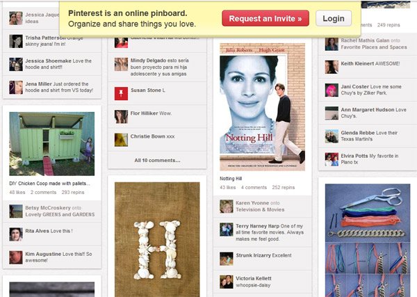
The design of the site, which features an ever-changing, grid-like format, really favors engaging images. Even though comments, number of repins and likes are displayed, my guess is that people pay very little attention to them. Really, it’s fairly obvious; would you rather look at text or an interesting image?
Pinterest’s design
Besides improving the quality of their images and other content to be shared on Pinterest, sites are also imitating the cool grid design. As I briefly touched on, visuals are more intriguing than plain text, even with catchy headlines. To take advantage of this, some blogs and product-based retail sites have revamped their sites with an interface similar to Pinterest’s. I’d assume that this design gets visitors to click on more things for two reasons:
- Images are more interesting
- More images can be shown on screen at a time
 At this point, the sites that have adopted this design haven’t incorporated any social functions to create their own little social network. I think, in this case, this is a good thing and social media should be kept to the popular social platforms. However, this doesn’t mean that the ability to Pin, Tweet, and Like couldn’t be incorporated into the grid interface. In fact, this would probably even further the likelihood of social sharing.
Who would have known that a site that started two years ago, and only recently became popular, would have such a far-reaching effect on both how people use the internet, and also how people design for the internet. The effect of Pinterest is a simple example of the power of innovation.
 SEO is Evolving: Trend You Need to Know About [Infographic]
 Importance Of Professional Social Media Services For Businesses
 Social Media Makes Sales Enablement Easy By Showing How Smart Business Can Be
 14 Tips To Help You In Marketing Your WordPress Site
{ 7 Responses }