• Skip to primary navigation
  • Skip to main content
  • Skip to primary sidebar
  • The Famous Blog
    • Blogging
    • Social Media
    • SEO
    • Marketing
    • Design

Famous Bloggers

How To Blog and Start a Business

  • Contribute
    • Submit News
  • Login

Home » The Famous Blog » 3 Smart Ways To Skyrocket Conversion Rates & Not Annoy Your Readers

3 Smart Ways To Skyrocket Conversion Rates & Not Annoy Your Readers

December 5, 2011 - Last Modified: February 14, 2013 by Gregory Ciotti

Skyrocket Conversion Rates

When it comes to increasing conversions, you as a blogger are in a tough spot. You have to find balance between converting visitors to subscribers and also making your site “inviting”, or not too aggressive and annoying in it’s pursuit of more opt-ins.

While you might have seen things like pop-ups and feature boxes work, even these great methods can cool off and your conversion rates will start to level out.

So how can you keep things fresh and increase conversions?

Below I have 3 fresh strategies for capturing more emails while not annoying your readers.

1.) Scrolling Sidebar Opt-in

This might sound a bit confusing, but hear me out.

I’ve seen this strategy used a lot on design blogs, mostly because those bloggers are really into the latest emerging trends in design.

However, I’ve yet to see it used on a big marketing blog until just recently, and no surprise, it was the well designed and meticulously tested KISSmetrics marketing blog.

Here’s what I saw when I clicked on the latest KISS article by Danny Iny:

KISSmetrics

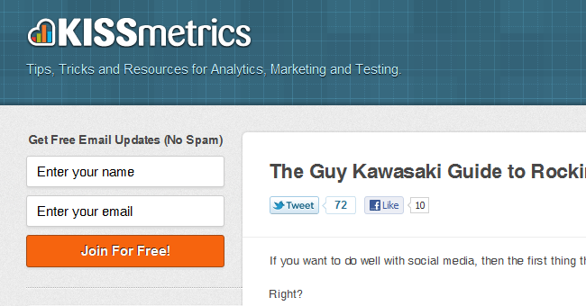
But I noticed something unusual…

When I scrolled down to continue reading the article, only the header (with the KISSmetrics logo) actually left the page.

The content was scrolling, but everything seemed to be the same somehow.

It didn’t take but a second to realize that it was because the sidebar was scrolling with me.

Basically, the sidebar was “sticky”, it stayed with the page no matter where I scrolled.

Let’s take a look at the contents of this sidebar:

  1. Email opt-in form
  2. “Resource pages” (infographics and marketing guides)
  3. Sharing buttons, or on the homepage, buttons to ‘like’ or follow KISSmetrics

What do all of those things have in common?

I’ll tell you: they are the most important things on your sidebar!

With one single scrolling sidebar, the KISS team has all of the important stuff in view at all times.

No need for “above the fold”, the good stuff is always in sight!

This also cleans up the post content really well.

Why?

With the opt-in and social sharing always present, there is no need to put them into the post anywhere (no need for footer opt-ins, social buttons everywhere, etc.)

Some really cool stuff by the KISS team, you should look into seeing if it would work for your blog.

2.) “Mini” Feature Boxes

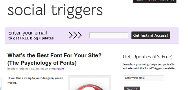
You’ve probably noticed the rise in the use of “Feature Boxes”, largely started by Derek Halpern over on SocialTriggers.

You see them everywhere now, I’m even rocking one on my site!

What you might not have noticed, however, is the smart use of “mini” feature boxes on the inside of posts.

Two of my favorites come from SocialTriggers itself and from sites like PassivePanda.

You’ll notice that the feature box on post pages (ie in a post and not the homepage) is different and more “compact” than the one you will find on the homepage of the site.

This is not to not be overly aggressive and to make sure people don’t become “blind” to seeing the homepage feature box.

SocialTriggers

I’ve talked with Derek via email briefly about how it’s been working, and he says the conversions are good enough to warrant keeping it.

In a nutshell: it works.

It helps keep something above the fold that stands out and asks for an email, but it is also less intrusive than a full feature box on every page, and also stops people from becoming “blind” to the main feature box.

Combined with adding an opt-in on the footer of posts (and of the site) and adding the classic sidebar opt-in, you will be aggressively chasing emails without being too annoying.

3.) Click-to-Subscribe Options

One of the biggest changes I’ll think we’ll see in 2011 for opt-in strategies is the “click to subscribe” type of opt-ins.

Once again, KISSmetrics is leading the way in this field.

Just check out this little widget at the bottom right of their site:

KISSinsight

Just a little pop-up (similar to the ones on WordPress.com) that asks if you’d like updates. The tool they are using is their own, it’s called KISSinsights.

Sure, that’s cool and all, but what happens when you click it?

Do you get taken to a regular landing page, where you might lose the conversion?

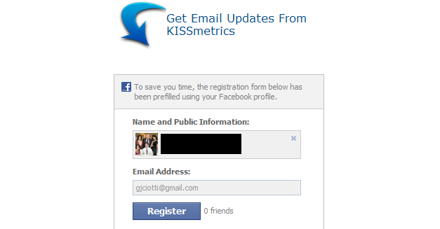
Nope, you get taken to Facebook connected AWeber opt-in that already has your information filled out.

Pretty smart.

(That’s my real email by the way, feel free to say hi but please don’t spam me :))

It doesn’t end there though.

With tools like HelloBar and the ViperBar, top of page bars can be used for this as well.

Check out the HelloBar in action over on Problogger.

Problogger

Right now, Darren is using his bar to promote his new e-Book.

However, you could easily replace that noticeable (but unobtrusive) link with a link to the Facebook opt-in, or some other sort of opt-in page (especially if you use tools to pre-fill in subscriber information, such as if they’ve left a comment before).

The “click to opt-in” strategy is great because it grabs attention without being annoying.

It’s also really easy for people interested in subscribing, and the easier it is to subscribe, the more people will.

The Facebook option (available on AWeber, here’s a link to the post explaining it) is especially good because people often stay logged into Facebook, making it easy to pre-fill in info.

Whatever opt-in method you use, these “click to subscribe” tools can really boost conversions while still keeping readers happy.

[box type=”note”]This post is part of our Blog Contest! If you like it, support the author by sharing it and adding comments. Also make sure to check other entries by visiting the blog contest page.[/box]

ShareTweet

Filed Under: Marketing

About Gregory Ciotti

Follow @GregoryCiotti

Gregory Ciotti is a content strategist who is obsessed with behavioral psychology. He's the marketing guy at Help Scout, the invisible email support software for solopreneurs & small business owners.

Reader Interactions

Related Posts

  • Marketing WordPress Site14 Tips To Help You In Marketing Your WordPress Site
  • Email marketing servicesComparing GetResponse and Infusionsoft: What They Have to Offer for Marketing Your Blog
  • Selling eBooks OnlineThe Beginners’ Guide to Creating an Ebook That Sells
  • Profound E-Commerce Blog9 Pro Tips for a Profound E-Commerce Blog

{ 26 Responses }

  1. Roman says:
    Scrolled sidebar with subscribe form - fantastic idea! Thank you!
  2. Trung Nguyen says:
    Recently, Glen from ViperChill has released his new premium WP plugin that allows us can add many signup option email forms to our blog, I think I'll give a try after reading this post. Thanks for sharing.
  3. Catherine says:
    Hi Gregory, Our website designs definitely has to take into consideration what you say - Do people like it, do they trust it/you and do you offer quality. I like the basic "trustworthy" email sign up in the sidebar. No pressure. Thanks for the good read
    • Gregory Ciotti says:
      No problem Catherine, glad you enjoyed the post!
  4. Morgan says:
    I'm still in the process of finding the right newsletter and the right way to present it without being pushy. I dislike the popups that ask me to subscribe before I've even had a chance to look at the website! These are fantastic tips that I'm definitely going to be keeping in mind. :) Thanks so much!
    • Gregory Ciotti says:
      No problem Morgan, glad you enjoyed it!
  5. Mark says:
    That click to optin option looks pretty interesting. I have been using a one time only popup that says: YOU WILL NEVER SEE THIS AGAIN! However, I will definitely explore this option. Thanks for the suggestion, Greg. Mark :)
    • Gregory Ciotti says:
      No problem Mark, glad you enjoyed it!
  6. Jamie Northrup says:
    I like the first 2 better than the third one. I really like the sidebar on KissMetrics, simple and to the point.
    • Gregory Ciotti says:
      Thanks Jamie, glad you got some value out of the post.
  7. Tushar says:
    I believe the best option out of 3 is the Click To Subscribe button. If I am on your site, I will prefer to click on the link than writing my email address
    • Gregory Ciotti says:
      Definitely a good one, and now that you can incorporate Facebook as well it makes it even better,
  8. Grady Pruitt says:
    I was just about to get started checking my site for conversions, and these are some great things to keep in mind as they do so. Thanks for sharing!
    • Gregory Ciotti says:
      No problem Grady, glad you enjoyed the post!
  9. Dave Lucas says:
    I've tried add-ons and toolbars in the past - they may not be a problem at first, but if you ever sudden;y get readers complaining about annoying popups and slow-loading pages, while some of your advertsiers start yanking their ads, you'll know it's an add-on... the real challeneg is finding WHICH one, because they hide the URLS outside your code! AND nothing is worse than seeing a great article on a blog and then when you go back and enter via the homepage it is impossible to find, even when wading thru tons of crap! People laugh when I say I blog on blogger/blog*spot - but at least you can always be sure you will find what you are looking for when you visit! Blog ON!
    • Gregory Ciotti says:
      Solid points Dave, it more about testing what works with your audience and making sure that you don't go overboard.
  10. Raj says:
    In one of my sites, I just mention at the end of the post that there is an email subscriber box somewhere in the sidebar, with which you can subscribe to new posts via email. People literally need to search for it. Yeah, its my way of filtering out the ones that are not going to read even a single post from these subscriptions.
  11. Nishadha says:
    Thanks for sharing this great post, I especially liked the idea of scrolling side bar, will definitely consider adding it to our blog.
  12. Helmi says:
    For me, the social/subscription bar like HelloBar is the easiest among all three methods. There are few Wordpress plugins which we can use. The first one can be toughest for those who has limited knowledge on coding. For me, I personally love the last one. Sometimes, to have something following me llike the social sharing button can sometimes affect my concentration in reading the articles. The concept is good but the way it is implimented and designed should be reconsidered for some of the wordpress plugins.
    • Gregory Ciotti says:
      Definitely Helmi, in fact the main complaint I have with the sliding sidebar is that it distracts your eye. Best practice: split-test and see how it works versus the normal option.
  13. Ryan Biddulph says:
    Hi Gregory, Smart stuff here. Danny seems to be ahead of the crowd in regards to this topic. Find a balance. Avoid annoying or plastering your opt in form everywhere but make it visible enough to build your list and increase conversions. Subtlety counts a good deal. The scrolling sidebar option is good. Really good. As you note, the above the fold mindset goes out the window. The form is always there. Another thing I like about the forms: not at all obnoxious. Simple, clear, focused and directed. You do not need every bell and whistle in the book to convert someone or to even get them to sign up. Simple really does work best. Some food for thought here. Thanks for sharing with us Gregory. RB
    • Gregory Ciotti says:
      Thanks Ryan, glad you enjoyed the post. I should point out that while Danny guest posts on KISSmetrics, he's not actually a member of their team and would therefore have no say on the design. I am going to be doing a mini-interview with Sean Work of KISSmetrics later in the month, who DOES have a say on the design. Either way, you're right, it's some smart stuff for sure!
  14. Sandy says:
    Great post and very good to know. I recently put a lightbox on my blog and the conversions went up dramatically. I thought it would annoy people at first and was I wrong.
    • Gregory Ciotti says:
      Lightboxes definitely work, but you haven to be careful and consider your niche as well. Glad it's working for you!
  15. Tory says:
    Good stuff Greg! I've been wanting to test out aWebers new Facebook sign-up form, but it just doesn't integrate with any of my existing landing pages or forms. I wish we had more design control with it. Anyways, good post man! You gave me some good ideas to test out!
    • Gregory Ciotti says:
      My pleasure Tory, I knew that the Facebook optin would be useful, but you're right, it's hard to integrate design wise, that's why I loved the "click to opt-in" strategies I mentioned here!

Primary Sidebar

Our Newsletter

Our Newsletter

Join our mailing list to receive the latest news and updates from our blog.

You have Successfully Subscribed!

Popular Articles

  1. How to Set Half Rating Scale 1-5 (Poor to Excellent) by Words 116,303 views
  2. Top 10 Sites Where You Can Get Paid to Write 115,890 views
  3. How to Get Targeted Twitter Followers Fast 92,104 views
  4. 66 Awesome Social Media Quotes 78,422 views
  5. 50 Traffic Sources You Should Milk Like Crazy 75,143 views
Schema Structured Data for wordPress
  • Blog
  • Contribute
  • About Us
  • Contact Us
  • Disclosure Policy

Copyright ©2020 · FamousBloggers - All Rights Are Reserved · Powered by Genesis Framework

  • Login
Forgot Password?
Lost your password? Please enter your username or email address. You will receive a link to create a new password via email.
Go to mobile version