• Skip to primary navigation
  • Skip to main content
  • Skip to primary sidebar
  • The Famous Blog
    • Blogging
    • Social Media
    • SEO
    • Marketing
    • Design

Famous Bloggers

How To Blog and Start a Business

  • Contribute
    • Submit News
  • Login

Home » The Famous Blog » 14 Design Mistakes That Could Cause Your Site to Fail
14 Design Mistakes That Could Cause Your Site to Fail

August 13, 2010 - Last Modified: February 14, 2013 by James Johnston 3,658

Design Mistakes

It doesn’t matter how well you write, that you have the best products and services if you have a poorly designed site. As a designer, I often see site owners with very little to no design knowledge building sites. Some of these sites turn out great, but many are flawed or have design no nos. Sadly no one tells them they made design mistakes or they do not believe/care what others say and do not know that are killing their return traffic to their site.

As a fairly new Designer myself, I have made design no nos over the years, but once I learned the rules, I learned from these mistakes. Most of the mistakes I made were minor ones. I was lucky enough to have taken intro to web design back in college.

Below is a list of Design no nos that everyone can avoid. You do not have to be a designer or know much about design trends to avoid these mistakes. If you have made any of these mistakes on your site, spend some time and fix them. Your readers will thank you for it.

1- Bad Color Choices

When designing or customizing a theme, use colors that complement each other. One thing to remember is to use enough contrast in your complimentary colors that then you can easily read the text. If you use a dark colored background with a dark text or a light background with a light text color will make it very difficult to read.

Find the right colors for site can be hard, so use a color palette generator to generate your color scheme. Once the generator creates all the complimentary colors, choose just a few of those on your design. Use between three and five colors. Remember not to overdo it!

3 sites to help generate color pallets for your sites

  • ColorSchemeDesigner.com
  • ColorJack.com
  • ColorSchemer.com

2- Noisy Backgrounds

Loud backgrounds with lots of patterns and colors can be distracting. To make thiingworse, some might put a busy background image and put body / content text directly over it. This can be very hard to read. As you can see from the image below you can not see all of the writing, and what you can see of is hard to read.

One of the new trends in web design is to have a loud back ground. To help prevent against background distractions, designers will use flashy backgrounds but they create a solid color for the text and banner areas. This way, designers can showcase their design skills in the background and their readers can still read the site content without issues.

background image with text

3- Too Many Ads

When designing a website, never make advertisements more important than your content. There should always be more content than advertisement. Take a look at the top ranking and most popular sites in your niche, in most cases these sites will placed their ads in a way that does not hurt the content and annoy their readers. They almost never clutter up the pages with ads their readers will never click on. They are selective with what they choose, they rotate their ads if they have more ads then then what they can display, they will rotate the ads. Readers do not like seeing ads, if they see a site loaded with ads, they tend to leave as fast they can. Having too many ads on your site can also slow the load the times.

4- Unwanted Pop Ups

There is a time and a place for popups, but there is never a time when popups dominate and randomly popup as you browse a website. If you are going to use ad popups, why not use it in a good way? Use the popup to ask a new reader to subscribe to the newsletter, and let them know if they get anything for subscribing. But make sure you set it to popup once a week and never ask them on every new page they open. Designers can code in timers that will look for a cookie on the reader’s computer and tell the code to pop the ad up only if there is not a cookie.The designers can then configure this to pop once a week or just once. Me, personally I hate popups, but the newer ones that only pop once, they aren’t so bad and I can deal with those.

It’s interesting topic, and there is a good article to read, Kikolani.com opened The Case For and Against Popup Opt-In Forms.

Below is an example of a popup subscription offer from Famous Bloggers. Hesham uses a great little plugin called PopUp Domination to create and control the popup.

exampleofgoodupad

5- Using Font the Wrong Way

Do not use crazy fonts in the body of the text. If you plan to add a fancy script to your tittles and sub titles you may want to think about that carefully and understand what could happen to your readers who can’t read those scripts. To avoid any issues that could come up, use standard fonts such as Arial, helvetic, Verdana, Goergia, or Times New Roman. These founts are found on most computers. Not all computers have every font that can be  found on the net. When a reader comes across this issue the page loads funny and may load errors as well. They will consider this a design flaw (and it is) land leave your site for something that is easier to read. Another issue that needs to be pointed out is, some of the fancy scripts are hard to read, most of them are considered eye candy and should only be used in graphic design, and not body text or titles on a website.

fancy font

Font Source: a bite

6- Using Text Without Images

Just having text can be boring. Readers need to have a something break up the text. Having just one image related to your text can help readers stay just a little longer and continue to read your content. For me, finding the right picture for the topic can be hard. Based on advice I have been given in the past is to find images that go with your topic. It doesn’t have to be literal it can be symbolic, or whatever you feel like. Try and keep it simple and somewhat related to your topic.

Just Using Text is Boring

text only

Good Text and Image Design

image with text

7- No Content Formatting

A lot of times I come across sites that has large blocks of text and almost no formatting to the content. This is bad design, to avoid this, break the text up into paragraphs, use titles when you changing subjects, bullet points for quick reading and for key points. Implementing this type of content formatting is easy on the eyes, makes it easy for readers to skim the articles and its good for SEO.
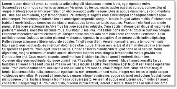
No text Formatting

8- Extra Small Fonts

When designing a site, do not use text under 12pt, anything less than that is to hard read. Readers should not have to adjust their font size or add the web page setting to see everything better.
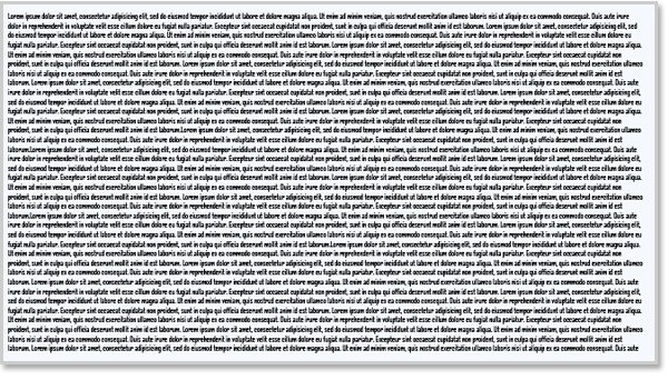
small font

9- To Many Images and videos

Adding images and video can help add visual appeal to all the text, but do not add to many images. If you add to many images and videos can slow the load time on your site, if you need to add a lot of images, try storing your images on site such as Flickr and use thumbnails that link to full-size images.

10- Heavy Flash Usage

Flash can add to a site, but if your whole site is nothing but flash, that isn’t a good thing. Flash is a resource hog. It slows to load and it’s not SEO friendly. Never use flash to create an intro.The only sites that can get away intro with flash are movie sites. So if you are not building a site around a movie, then there is no reason for it. Most people just skip it and go strait the content.

11- Music or video that loads automatically / no controls

Another major no no is, you should NEVER have music or video automatically play and have no controls to turn it on or off. This is bad design; most readers hate it as much as I do. If readers can’t turn off the music or stop the video from playing, readers will get annoyed and leave the site.

12- Poorly Designed Navigation

Poorly designed navigation is a site killer. If a reader can’t navigate your site or its too hard to figure out, readers are not going to stick around. Good site navigation should be at the top of each page, and should be organized so that it all parts of the site are defined.

13- Link Color Does Not Change

When styling links, make sure the colors change, once that link has been visited. Readers need to know what text are links and if they already visited that link. If links are designed in a way that looks just like regular text or there is not a visible change to the link, this can cause confusion. Make it easy for your readers change it up, even its just a slight color change, your users will be able to tell what’s a link and if they visited it.

14- Lack of Contact Information

One of the most annoying things you can do, is not have a contact page or even adding this information somewhere easy for your readers to find. If you are selling products and services, it’s even more important to have a way for your customers get in contact with you. You could easily loose a sale because they couldn’t reach you or thought your site might be a scam site because they cannot get in contact with you.

What else can we add to the list?

ShareTweet

Filed Under: Design

About James Johnston

Follow @element321

spends most of his free time using social media and loves to teach others about design, web development, CSS, SEO, and social media. He is addicted to Wordpress, and social media. You can reach him website, Evolutionary Designs Blog.

Reader Interactions

Related Posts

  • Start new blog post10 Techniques how to Start a Blog Post to Engage Readers to Stay on Page
  • How To Deal With Writing Blocks5 Writer’s Blocks, Which Prevent You From Writing The Next Blog Post
  • Write articlesEasy Ways for Writers to Write More Articles
  • Divi 3.0 Special Discount: 20% OFF Divi Theme from ElegantThemes

{ 93 Responses }

  1. Brett Widmann says:
    These are really helpful tips! I hate websites that have too many colors and too much stuff jammed onto one page. It is really distracting and frustrating.
  2. MKR says:
    I've always wondered about the suggestion that you add images on every post. I see it everywhere, but it doesn't seem to be as essential as it's often made out to be. Some of my most read posts had none. I use big header text to break posts up, and response to it has been good. This also seems to be the way it's done on similar blogs to mine. I get the feeling there's a lot of cargo cultism in that suggestion. I've run in to a lot of posts where the images made it look cheesy. And I've never avoided reading a post for lack of images. I would say the single most important thing is contrast. Make sure every element stands out as much as it needs to, and not much else matters. It seems to be the one thing that makes or breaks a site. If you get everything else right and fail there, the page can be unreadable.
  3. samuel says:
    Trying to make it brief: balance and common sense is what we need. I'm an IT person who developes web sites, i.e. i'm not a dessigner. How i solve it? I buy themes or use the free ones. It's easier to show options to clients, and they have a lot to choose from. I've added your post to my favs, in order to don't forget the list :) Thanks for the tips!
  4. Udegbunam Chukwudi says:
    Pop-ups and music on autoplay remain my greatest pet peeves when it comes to web design.
  5. Colleen says:
    Nice post James. I kinda held my breadth as I read through the list hoping we were not guilty. I looks like we have a passing grade, however, I'm reminded I need to add some images to a few of our article pages. You did a great job in using examples. Nice work! ;)
  6. Jackie says:
    I am not a web designer and I always wanted to be.... I work in the IT department of a company and I love all apple products. First, ALL of you above that posted ARE 100% right. Website should not have pop-up, flash, splash, or heavy amount of ads or images. However, Element, I can't see a think on YOUR SITE... You have icons, images, and social network buttons, and flags all over the place! IT TOOK ME AN ADDITION 10 MINUTES just to get to the bottom of this page to post! You need to review your site. Most of the text IS COVERED WITH the right side menu bar!!??? I am using a window machine!! So, since I carry my iPad with me, I figure maybe it depends on the web browser. And I am right. YOUR SITE looks awesome on the iPad or maybe its the Safari Browser. On my Window machine I have INTERNET Explorer! So, I guess my apologizes goes out to you but may I make one suggestion, please check you blog on multiple web browsers. NOT everyone uses an iPad or Safair's Web Browser! Great Blog!! I am a subscriber!
    • Hesham says:
      Thank you Jackie for the great feedback, I have designed this blog, and you are right.. it's missed up on IE, but I am working on fixing that soon!
  7. bryan says:
    Hey Element, You got a good list there. Very comprehensive. I think I like to add another point to the list there if you don't mind. What about clutter and orientation of things on your website. You mentioned something about navigation and the about menu to help visitors navigate around and find info. I think the way your info is displayed is also important. Not too messy or cluttered. Ease of use when you are surfing around your website.
  8. C5 says:
    I guess I have to put more effort on including pics. For me, though, I prefer sites that are functional. I also tend to leave out sites that automatically plays music, especially if it's noisy.
  9. Mike says:
    Pop-ups are my concern as well because obviously, it keeps irritating me. Sometimes I need to fill in just because that's the only way to let it disappear. And I think the reason why opt-in rate increase is that people want it to disappear, not irritating them anymore. Any thoughts?
    • element321 says:
      Mike, you make a great point, that people may sign up, just to get the stupid things to go away. Website owners need to add this to list, to think about when adding a popup campaign to their site.
  10. Patrick says:
    At the beginning its all about trial and error.To get that perfect site you need to go through a lot of experiments to find out what exactly suits your users.Yes but you have laid some basic points like avoiding too many ads,videos,pictures,too many pop ups etc.These may turn off your readers.
    • element321 says:
      Patrick, you are right its about trial and error. If you build a site that you like to much but don't care what your readers think or listen to web designers, readers and anyone willing to help, then your site will fail.
  11. element3 says:
    Thanks everyone for replying. I will reply back and answer any questions I can as soon as I can. I just got back from a trip out of state where I did not have have access to the internet or cell coverage. Thanks again guys...
  12. Hieu Martin says:
    With me the important is content then design. alway try design the best for my blog
  13. Laura Davis says:
    Great suggestions! I've seen a lot of mistakes on new (and even established) sites that you've covered with this post. Thanks for showing us how its done!
    • element321 says:
      Thanks Laura for stopping by and commenting. :)
  14. Dennis Edell says:
    *sigh* those friggin images; always forgotten! Good thing I'm starting over. ;)
    • element321 says:
      Dennis, Thanks for stopping by and commenting. If you have any questions, let me know :) can't to see what your new design is going to look like.
      • Dennis Edell says:
        DE.com isn't getting a new design, I just need to finish "filling in"; I got way sidetracked on that. When I said, "starting over" I meant content, hopefully remembering images this time. :-)
  15. Luqman says:
    There is lots of self webdesign website on the web today, that I wonder how they manage to design such beautiful and friendly site. But I come to know that, there are lots of this type of post and tutorials online that can help one to design a nice website. This post is very useful and it correct some of the mistake self webdesigner and some professionals make at times.
    • element321 says:
      Thanks Lugmans, So true. Just the other day, I took a look at professionally designed website with several design flaws. I wonder if they were put there because the website owner wanted them to put a design feature that was a no no or if they simply didn't know better.
  16. Kharim says:
    This is a really great post. Really excellent points brought out here. These are things that turns away visitors and readers from our blog and if we don't correct these mistakes then not just our blog needs serious help but also the creator of the blog :D
    • element321 says:
      Thanks Kharim, You make a great point about the creator. I have seen several sites that refuse to change their design flaws. And yet they wonder why their site is ghost town.
      • Kharim says:
        That's true element :D lol
  17. Andreas says:
    For me, more important than the actual content, is to make sure that the design is clean and the navigation structure is easy to follow.
    • element321 says:
      Great point Andreas, I tend to not to stick around a site that doesn't have the a clean design and easy nav structure. Sites with those issues, can get annoying and it takes to long to find what you are looking for...
  18. Kok Siong says:
    I do not like the pop up especially for the pop up advertisement. It is irritating. I seldom subscribe to the blog that using pop up ads. The website that has too many images will load very slow too.
    • element321 says:
      Kok, I almost never subscribe to these popups. Sites with a lot of images do load slow. I am actually about to move all my images to a offsite image server that is design to serve linked images very quickly. Sites thats have a lot of images, should think about implementing this type of design.
  19. George Serradinho says:
    I personally hate pop ups and they irritate me a lot. I also hate flash sites as it always takes time to load and then I just leave the site and move on.
    • element321 says:
      I do the same. I still don't know why site still build with flash. Funny I am taking a flash class next semester and I hate view sites made from flash. However, Flash does have its place, but it should be limited and not used for entire site!
  20. Nea says:
    Great post! When I first started blogging I didn't realize the importance of content formatting. It really does make it hard to catch someone's interest when there's just a long stream of text. Lesson learned.
    • element321 says:
      I had the same issue when starting out. With web design, I was fine, but for blogging and creating new articles, I treated like writting for a college paper. No one wants to read that style of writing, not even a college professor.
  21. TJ McDowell says:
    So I'm trying to understand your suggestion on changing font for visited links. To me, I usually feel that a design looks more professional if all the links look identical. What are your thoughts?
    • element321 says:
      Links should be identical and match every other link on your site. By different I mean, Link needs to link different from the string of text that isn't not a link. If they are same and their is no different no link text and link text, a use will get annoyed and can't find there way around the site. That also leads to bad navigation as well. :)
  22. Imran Yousaf says:
    I really dislike Pop ups that forces you to click them and have no close option. Second thing is hard to read fonts. I don't know whats fun of using such fonts in web sites which keep readers from reading the content. Well i like your post as it has important points in its start which shows that points need immediate attention. Good Work.
    • element321 says:
      Thanks Imran, I don't know why people use the fancy fonts either. Web content should be done only in basic fonts at a good size so everyone can read them! I also hate popups that don't allow you to close them. Those that implement them are shady and are the worse kind of popups.
  23. Dr. Lawrence Kindo says:
    An absolute must read for every new blogger! All 14 points well taken. Have added some zest to my blog after reading this post. I am sure it will help many others.
    • element321 says:
      Thanks Dr. Lawrence Kindo, Your site looks good. These design tips were written for new bloggers :) Hopefully they will help everyone that stumbles across this article.
  24. chandan says:
    If I say about design, I never find any blog that compare with your blog design. One most irritating things for blog is using pop up. I completely hate the pop up ads.
    • element321 says:
      Thanks Chandan, Popups seem to be the worse design thing a site can do. Everyone on here seems to hate them most. Its hard for me to disagree. they get in the way and they are annoying..
  25. Gino Dizon says:
    Nice post! It sure is difficult to choose the right theme for your blog. But when you find it, you sure know that it's for you. And you'll also have a feel that it has a great similarity to what your site offers your readers with. Good job!
    • element321 says:
      Gino, thats a good way to think about it. Your site design should reflect you or your business the site is based around.
  26. Andrew says:
    I agree with everything you said. One thing I always look for when visiting a new site: an About page. I like to get to know the owner a little. Know their background, see them, etc. Andrew
    • element321 says:
      Andrew that is a good point! About pages are important. I must admit my isn't the best. I am working on a new one, I just haven't had the time to complete it yet. A good about page is a good thing to remember when building a site.
  27. Colleen says:
    Thanks James. Most times I read blog articles and walk away pretty much discouraged. It appears I've covered most the points you have outlined, however, there are a few items I need to address. Good post today James. :)
    • element321 says:
      Thats great Colleen, address those issues should help your readers and keep those new readers on your site.
  28. Charles says:
    Great article. I myself struggled a bit looking for the right theme for my blog. To be honest even though I like the one I currently have there are things about it I would like to change but 1) my knowledge about HTML for templates is limited so it takes me a while to research info online and eventually, after much trial and error, I make some minor changes but not 100% what I wanted, 2) because the theme belongs to someone else I don't know how much of it I can change without breaking some kind of legal usage of the template and 3) I have no background creating skills and don't know anyone who could help me make new background images to create my own unique template. I was wondering if you could take a look at my blog and provide some ideas of what my be wrong on it so I can at least see what I can do to fix them. In the mean time I'll keep educating myself of web design.
    • element321 says:
      I can take a look at your site. Please go to my contact form http://www.evolutionarydesigns.net/blog/contact-us/ and send me an email with what you like and dislike about your site. I did take a quick look at it and it looks pretty good. I will have more time look over tomorrow. As for TOS (terms of service) some themes allow changes as long as you site where you got the oringinal theme, usually its already there. If you go premium, they pretty much don't care what you do with it. To find out more about your theme, go the author's website, on there they will have what you can and can't do with their theme. I am still not very good with WordPress themes, I generally purchase a theme or get a free one, and modify it till I get what I want. I know how most themes work, I just have to figure out what file controls what sets of code and what happens if make change and what else is effected by those changes. It takes time, just practice and eventually you will get better at it.
      • Charles says:
        Thanks element. One thing I am curious about, this is for anyone who can answer this, is how do get the background themes you like? Do you make them yourself (if you have photoshop skills), do you find or have someone who has photoshop skills to make them for you based on what you want it to look like, do you pay someone to do it for you or are you simply lucky enough to find one that is almost exactly how you want it? I plan on getting a domain of my own and I know I will have much more control over the look on my theme so i want to figure out the best way to make a theme how I want it. The current one I have has a lot of how I would like to see mine look like but there are things I would like to change. I'll send you the email of what I dislike about my current theme. Again, thanks.
  29. Trevor B. Reed says:
    I completely agree about pop-ups. They are just spammy and if your website is organized correctly, your call to action buttons in conjunction with your conversion form should capture potential leads. Also, thank you for calling out flash and intros. They are terrible for SEO and incredibly annoying. Great list!
    • element321 says:
      Thanks Trevor. Flash intros annoy me almost as much as ad popups. I think movie sites are about the only sites that can get away with it. Then again, I have only seen a few that I truly liked...
  30. Robert says:
    Nice post, very informative, I particularly agree with you about the pop ups one. I never even bat an eyelid when I see a pop up, i just close it straight away and I wish sites wouldn't use them, I know many people say there subscriber numbers rocket, but is it really worth the annoyance to loyal readers?
    • element321 says:
      Robert, After reading all the other comments so far, I see most people agree with you. I find them annoying as well, and most of the time I never read them. Most people here can't stand them and never read them as well. Just from the amount of people commenting, think how many on here don't like. Designing popups into your site, is something a every website owner needs to think about before doing it.
  31. Lennart Heleander says:
    Hi James O my Gud – It’s information like a Bible, great job, so many things to think about. I hate when a page looks like a huge glittering Christmas tree with popup, flash, big and small ads everywhere, big and heavy texts over 600 -700 words right up down.
    • element321 says:
      I agree Lennart! This information like a bible! I love it. Thanks for commenting.
  32. Nabeel says:
    Hi, Impressive list. I think these are the basic/minimum factors a website owner should take into account. I still see some websites which make these mistakes. They should read this post! Kindest, Nabeel P.S. Typo in post: "9- To (Too) Many Images and videos"
    • element321 says:
      Nabeel, Thats why I wrote this article. People are still making these mistakes. Hopefully they will see this article and use this list help build a better site for themselves and their readers.
    • element321 says:
      Thanks for catching the Typo, To and Too have always been an issue. I always forget when I am so suppose to use Too. I thought I had caught them all. I will have to get Hesham to edit the article for me... :)
  33. Mani Viswanathan says:
    Impressed with your list-up. Even Typography matters when it comes to designing along with some css decorations.!
    • Hieu Martin says:
      The best design is use css decorations. I guest so
      • element321 says:
        CSS is very popular and its getting more important to web design daily...
    • element321 says:
      Thanks. CSS decorations are a great to add to your web design. CSS rocks!
  34. ian in hamburg says:
    I had to laugh about number 4: unwanted pop-up ads. So what do I get while reading that? A pop-up ad! For many people, ALL pop-ups are unwanted, whatever their placement or purpose. They're intrusive and annoying.
    • element321 says:
      Ian, Yeah I know. It is kinda funny. But I only see that popup once a week and its not like its scam or trying to get you to buy something... As for all popups, there is no way around them, I am starting to see a lot of the big name sites add popups like this sites. Only way around them, is to get a popup blocker. I really don't recommend them, they can slow your browsing down and you may something that popup that is important. As for hating all popups, do you also include light boxes that popup the image you click to make them bigger?
  35. Julius says:
    It's about time someone posted another design round-up for us to remember and keep in mind. :) This is quite a useful and informative article. I'm and advocate of well-designed blogs simply because of it's pleasing appeal and readability. As I was starting out blogging, I used to meddle with Blogger's design templates even thought I don't have enough knowledge of html. I just do research and apply them, even if I end up messing my blog. Still, I always aim for a better blog design. It's nice you've mentioned the annoyances on blogs, like pop-ups and the likes. I myself is sometimes annoyed by these and always think before putting something on my blog - if I myself would be pleased with that or would it be simply annoying. It's also a great advice to seek for well-designed templates. I do just that but in my case I still dig in to it and tweak it to my preferences. I just couldn't help tinkering around with my template's design. :)
    • element321 says:
      Julius, It been a while since I have seen a good list like this, I and I always wanted to do one. I was originally planning to do this article on my site, but it after thinking about it, there are more people that read this blog, so there for more will benefit from its here. For me, I get tired of seeing poorly designed sites, but have a lot of good content. when this happens, I rarely stick around a long enough to learn from it. Hopefully, some of the new bloggers out there will see this and help themselves build a better blog or get help from someone.
      • Hesham says:
        Super post James, I love it, don't forget to keep yourself logged in to your account :)
        • element321 says:
          Thanks Buddy... I just logged in... Chrome keeps logging me out even if I say to to keep me logged in... lol
  36. Aminul Islam Sajib says:
    Very nice post Tinh. As you've mentioned that unwanted pop-up is a designed mistake, I want to say something honestly. Though I believe that the pop-up domination used in Famous Bloggers is not unwanted, its repetition annoys me a lot. It comes up on each page load even when I'm logged in to the site. In my incredibly slow internet connection, which is 15-20 kilobyte per second, each time the pop-up takes extra time to load. Especially the 'close' button loads at the end. So, I'm pretty much unhappy with it. I hope Heshem will not misunderstand me. :)
    • Aminul Islam Sajib says:
      Oops sorry! I messed up. Now I noticed this is not a post by Tinh, it's element321! Anyway, great post element321!
      • element321 says:
        No problem. It happens. :)
    • element321 says:
      Thats strange. It only shows up for me once a week and only on the first page I pull up. I asked Hesham and he says its configured to pop only once a week and on the first page. It cookie based and when the cookie deletes itself after a week. So if the site does not see that cookie saying you have been there it pops up. If you have cookies disabled or you are running in private mode, this will disable Heshams cookie settings. I will mention your issues to him, next time I talk with him. If you have an issue with these popups, send him a message through Twitter or on his contact form and let him know...
  37. Brian says:
    Great information. I think color is often overlooked especially from a marketing perspective. There is an entire niche area of psychology dedicated to color. Different color elicit different reactions. It has been noted that different types of consumers (spontaneous buyers, researchers, traditionalists) favor different colors when making purchasing decisions. Knowing your target market and the psychology of colors can make a large impact when used properly in web design.
    • element321 says:
      Brian, I agree, I didn't mentioned that part of design, because there is just so much. I am planning to start doing some research on color. For me, color has always been an issue and to understand it more, I have to research and write about it.
      • Brian says:
        There is definitely a whole world of information regarding color psychology. Id be interested to see what you come up if you write a blog article about it. Good luck with the research.
  38. DazzlinDonna says:
    I really enjoyed this one, James, since I have been designing lots of sites lately (and I'm not really a designer). I do try to follow all of those rules, but I'm not sure I've been completely successful every time. Nevertheless, I think I might make a little cheatsheet out of your post, (condensed), to print out and keep it handy. Thanks!
    • element321 says:
      Thanks Donna, I thought this might come handy for designers and bloggers. Of your designs, I haven't seen any design mistakes. Those themes do look good.
  39. The Bad Blogger says:
    Woo... that's quit a list, well... I agree with all of it, but sometime is hard to even handle so many in one time, but I believe slowly through time, it can be adjusted. I think the formatting of font is important, because they are words that's gonna convert your reader to royalties for you, as most people read stuff when it the feels comfortable with their eye and also their mind.
    • element321 says:
      I agree, for me these are the most important parts of design. But formatting of font is very important, but formatting can kill a bloggers income. It can also ruin a graphic design project as well.
  40. Tran Tinh says:
    I can not agree more on the list and you are totally right. However, for newbie bloggers who do not have knowledge on designing is hard to pick up right color and rely too much on their designers. P/S: Do you mean "To Many Ads" as "Too Many Ads"?
    • Hesham says:
      This is the reason we must focus more on design! at least to know what's the general basics, standards to follow! By the way, thank Tinh , I fixed that typo!
      • element321 says:
        Thanks for catching this, I thought I caught all those...
        • Tran Tinh says:
          I have been in this case several times too friend :-)
    • element321 says:
      I agree, its hard for anyone starting out. Thats why I believe free and premium themes that are designed well are best for those bloggers and website owners. Then they should learn as much as they can about design. If they don't have time to learn then they need to hire a designer to help them create a custom designed website or theme.

Primary Sidebar

Our Newsletter

Our Newsletter

Join our mailing list to receive the latest news and updates from our blog.

You have Successfully Subscribed!

Popular Articles

  1. Top 10 Sites Where You Can Get Paid to Write 115,645 views
  2. How to Get Targeted Twitter Followers Fast 92,035 views
  3. How to Set Half Rating Scale 1-5 (Poor to Excellent) by Words 86,567 views
  4. 66 Awesome Social Media Quotes 78,368 views
  5. 50 Traffic Sources You Should Milk Like Crazy 75,080 views
Schema Structured Data for wordPress
  • Blog
  • Contribute
  • About Us
  • Contact Us
  • Disclosure Policy

Copyright ©2020 · FamousBloggers - All Rights Are Reserved · Powered by Genesis Framework

  • Login
Forgot Password?
Lost your password? Please enter your username or email address. You will receive a link to create a new password via email.
Go to mobile version