
Your website is as good as it is going to get, right? Or is it? Websites are never actually finished. And, we can all improve our website, even if it is just a little bit.
We can write better content, include more stunning graphics and make visitors stay even longer.
After all, keeping visitors longer on our website helps with search rankings (dwell time is something Google watches) as well as customer acquisition and retention (gotta make more sales).
It even helps our blogs too, as our readers might subscribe to our email list, and then will definitely come back for more!
So, in this post I want to show you 5 easy ways you can easily improve your website to impress your readers and keep them coming back.
1. Make Your Long Content Easier To Consume
This is a simple one, but one I often see neglected, especially on longer blog posts or web pages.
If there is too much content, people just can’t be bothered. Are the lazy, perhaps, but that is how the web is these days.
That is why you often see the TLDR at the end of many posts.
Don’t know what TLDR is – Too Long, Didn’t Read.
So, if your content is long, whatever it may be, make it easier on your readers and add both a table of contents and a summary (like the TLDR I just mentioned).
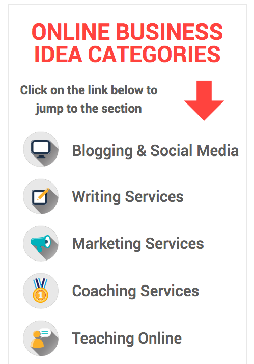
Nothing is better than seeing a few examples, so to begin, here is one from an absolutely enormous post I did recently (15,000 words) on business ideas.
Rather than expecting people to sift through the whole post to find what they needed, I added a handy menu right after the introduction. This allowed people to skip to the section they were interested in.
Make it easy. Make them happy!
Here is what it looked like:

Of course, you don’t have to create your own menu every time, you can just use a plugin that makes one for you. Here is a simple one you can grab from the WordPress plugin repository right now. Install it, add it to your post and choose which level of headings it should use (skip H1, as that is your post title) to create the table of contents.
Smart, and simple!
2. Include An Accordion To Help Reduce Information Overload
Many websites have a lot of information they need to get across to their readers. But, if you just dump it on the page it is not very easy to read.
Such information is is best served up in an accordion style format.
Depending on what you offer on your website or sell, will dictate where you can use this kind of “collapsable” format, but it can be very very handy.
One example of where this is often seen is in website FAQs. When you are selling products and services there are usually a whole bunch of questions people have. The answers are difficult to present on a page without it making too long, and people losing the overview.
That is where the accordion comes in.
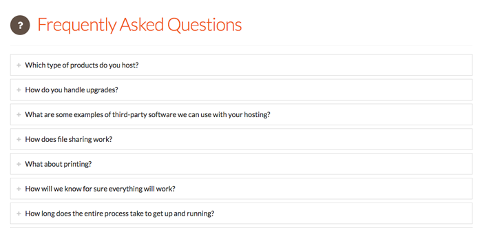
Here is an example of a web hosting company that provides an FAQ on their hosting service page, which gives their potential customer all the information they need without blowing up the size of the page. Instead, each is just a heading/question, then you click on it to open it and show the answer.
This is what it looks like:

A lot of themes that I use (like Divi, Thrive, X) have accordions built in, but if you want a separate plugin you can check out this post with a list of 10 free accordion plugins you could try.
Got too much information on a page, try the accordion!
3. Add More Visuals To Keep Them Reading
You might have noticed that websites and blogs are becoming more and more focused on visuals. This is probably driven by the fact that design really matters when it comes to making a great first impression online.
And although I understand that we are not all great graphic designers, it is not that hard to add some simple images to your blog posts (and pages too) to help break up those huge walls of text.
Just look at the last two sections of this post, they both have images. Not only does it help present the information to the reader, it makes it easier and more fun to read too.
One trend that is really popular in this area right now is to use animated GIFs. You can see this in posts from Larry Kim of WordStream. And it seems to be catching on in the blogosphere too.
No matter what kind of image you choose to add to your post, make it a habit to break up your text about every 500 words or so.
Your readers will thank you
Tip: For an in-depth look into this topic I highly recommend Andy Crestodina’s post which gives you a lot of detail and examples of how to use images for better impact in your content.
4. Add Tweetables and Other Social Share Alternatives
I am sure you know you should have social sharing buttons on your website. In fact, I bet you already do.
But are you taking it to the next level and giving your readers even more ways to share your content?
Maybe not.
One simple way to make your content easier to read, more interesting and more shareable is to add tweetable quotes.
This is a great way of highlighting parts of your post and making quotes at the same time.
If you do it right, and your post is worth sharing, it will be one of the most shared tweets from your content.
I do it on a lot of my posts, and even did it on that mega-post I mentioned in point 1. Here is what it looked like:


As you can see it is a nice way to break up the normal flow of text on a page.
If you want to give it a try you can either use an awesome social media plugin like Social Warfare, or go for the free download from CoSchedule which also does a great job.
5. Where Should Visitors Go Next?
When your visitors are on a page or post, they often have no idea where to go next.
Imagine:
- you are reading a great piece of content, and want more of the same
- you are about to buy a product but are wondering if there are more colors (shipping options etc)
You start to see the picture.
In many situations, readers or customers are looking for more. And you need to provide it to them or you lose them.
With blog posts this can be done easily in one of two ways:
- add links to related and useful content throughout your posts
- add a related post section at the end of the post (use a related posts plugin from this list)
The same kinds of things can be added to your other content (sales pages, product pages etc). Depending on the kind of content that is relevant, you can link to shipping information below a product, or show related products too. Relevance is key!
There are lots of options. Just don’t forget that wherever a visitor is on your website, there is another page that could help them further!
Your Website Could Be Better
Now you have seen 5 simple ways to improve your website, and it is up to you to decide which of these you think is most relevant and important for you.
However, one thing is clear, you can never sit back and relax as a website owner. There is always work to be done and improvements to be made.
Your visitors are relying on you – so go make your website better!